
 |
 |
 |
 |
 |
 |
 |
 |
Welcome to your ultimate typography and vocabulary guide! This page focuses
on the word whitehall, offering its quick pronunciation, part of speech, and
multilingual translations.
Dive into our large grid-lined layout patterns to visualize how to balance and structure each letter for any design.
Dive into our large grid-lined layout patterns to visualize how to balance and structure each letter for any design.
whitehall Serif Font Styles & Lettering Catalog
 |
whitehall |
 |
|
 |
LETTER ILLUSTRATION |
  |
|
 |
250px x 1100px |
 |
1-5-english-marugothic-2.jpg |
|
|
 |
Govt center in UK |
|
|
 |
/ˈwaɪt.hɔːl/ |
|
|
 |
proper noun |
|
|
 |
whitehall |
|
|
 |
whitehall |
|
|
|
whitehall |
|
|
 |
ホワイトホール |
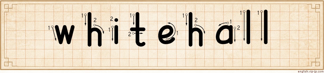
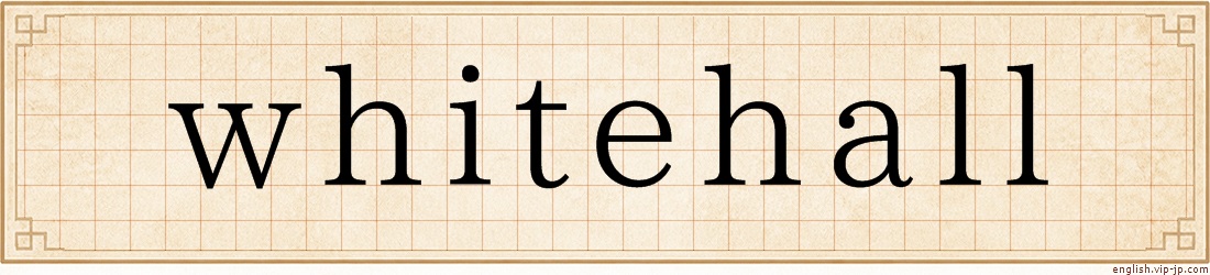
whitehall word lettering practice sheet on grid paper

Get inspired for your next project! These grids help you sketch balanced letters by hand. They are amazing tools for designing eye-catching school event banners, cozy home party invitations, or professional office signs. A quick layout check ensures your typography looks sharp and well-proportioned.
 |
SERIF DESIGN |
  whitehall whitehall |
|
|
250px x 1100px |
|
1-1-english-serif-2.jpg |
 |
SANS SERIF DESIGN |
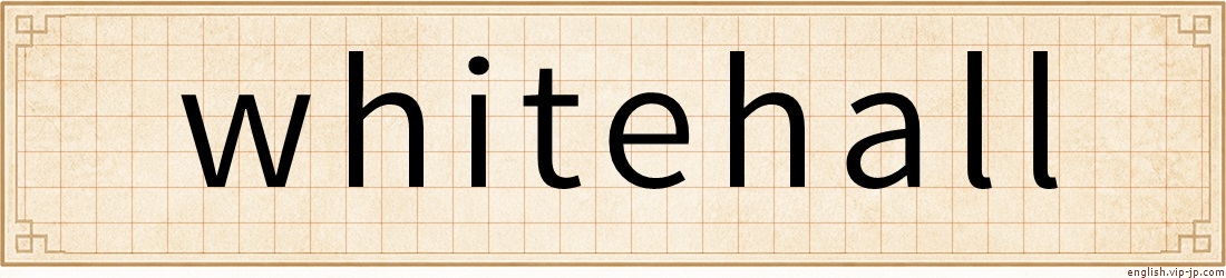 whitehall whitehall |
|
|
250px x 1100px |
|
1-2-sans-serif-2.jpg |
 |
SCRIPT / CURSIVE |
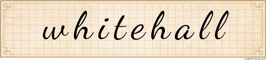 whitehall whitehall |
|
|
250px x 1100px |
|
1-3-english-cursive-2.jpg |
|
SCRIPT / CURSIVE |
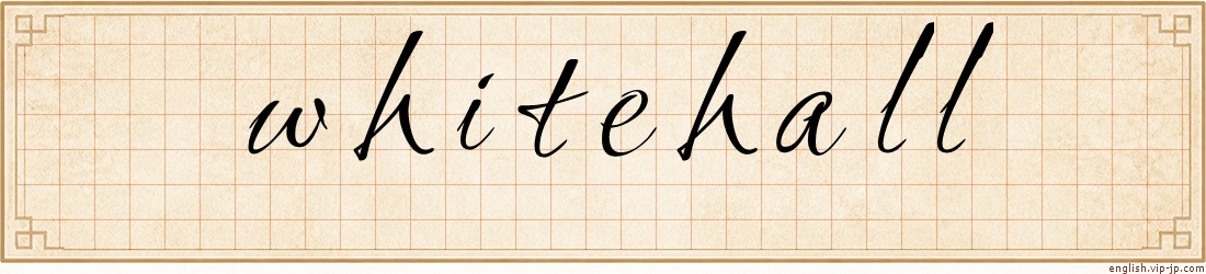 whitehall whitehall |
|
|
250px x 1100px |
|
1-4-english-cursive-2.jpg |
 |
GOTHIC DESIGN |
| whitehall |
|
|
250px x 1100px |
|
1-5-english-marugothic-2.jpg |


 |
 |
 |
 |
 |
 |
 |
whitehall Drawing Steps : Perfect Grid Layouts
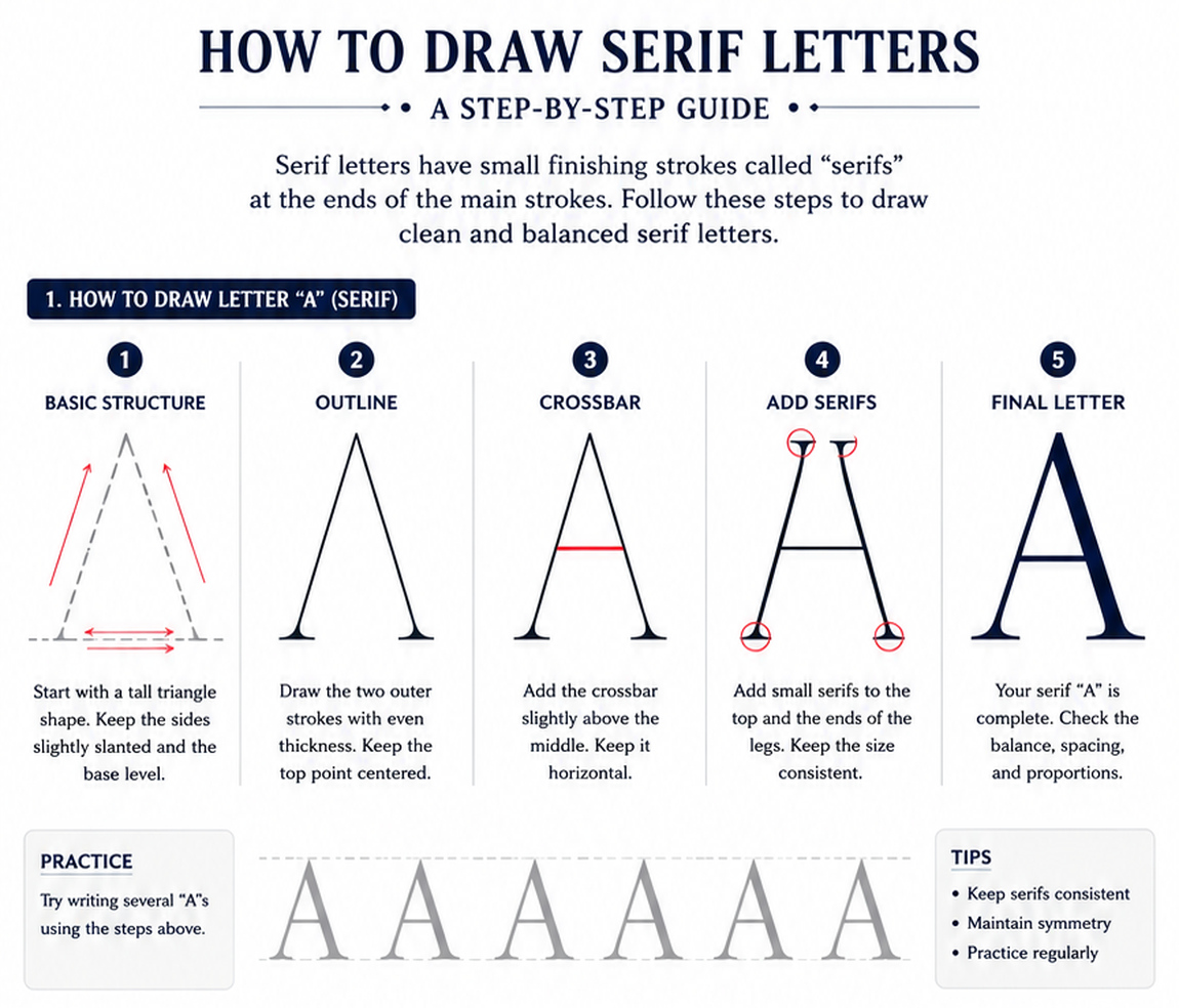
Mastering Serif Letters: A Step-by-Step Lettering Guide
Welcome to the next chapter of your typography and poster lettering journey! After exploring minimalist styles, it is time to dive into a classic, elegant aesthetic that has shaped the world of print media for centuries.
As illustrated in our comprehensive guide , we are breaking down how to accurately craft a clean, balanced uppercase letter "A" using the traditional Serif style.
Understanding the Character of Serif Typography
Unlike modern sans-serif styles, Serif letters feature small finishing strokes called "serifs" at the ends of their main strokes. These subtle, decorative details are the hallmark of classic typography, often seen in books, high-end editorials, and formal poster designs.
Adding serifs gives characters an elegant, traditional look, but it requires a high level of precision. The challenge lies in making sure these extensions do not distort the letter's core structure, keeping the overall design clean, professional, and readable.
The 5-Step Breakdown to Crafting a Classic Serif "A"
Follow these structured steps from the guide to build your letter with perfect proportions:
1. Basic Structure: Start with a tall triangle shape. Use light guidelines
to ensure the sides are slightly slanted and the base rests perfectly level.
Establishing this symmetry early prevents the letter from leaning. 2. Outline: Draw the two outer strokes following your structural guide. Aim for an even thickness throughout both legs, making sure to keep the top point exactly centered. 3. Crossbar: Add the horizontal crossbar slightly above the middle of the
letter. Ensure it stays perfectly horizontal to cleanly divide the inner
negative space. 4. Add Serifs: This is the defining step. Carefully add small serifs to
the top apex and the lower ends of both legs. It is essential to keep the
size and curve of these extensions consistent. 5. Final Letter: Your classic serif "A" is complete! Take a step back to check the overall balance, spacing, and structural proportions.Pro-Tips for Mastering Serif Layouts
When creating a full word or poster layout, keep these essential lettering tips in mind:
Keep Serifs Consistent: The length, angle, and thickness of your serifs must match across the entire character. Variations can make the typography look disorganized.
Maintain Symmetry: Treat the letter as two mirroring sides. The left slant and its lower serif should perfectly match the right side.
Practice Regularly: Consistent practice builds muscle memory. Use the tracing guide at the bottom of the image to practice drawing several "A"s until your lines flow naturally.
By understanding how to blend geometric balance with classic ornamental details, you can add a timeless touch to your hand-rendered signs, logotypes, and artistic projects. Keep practicing, and enjoy the art of lettering!
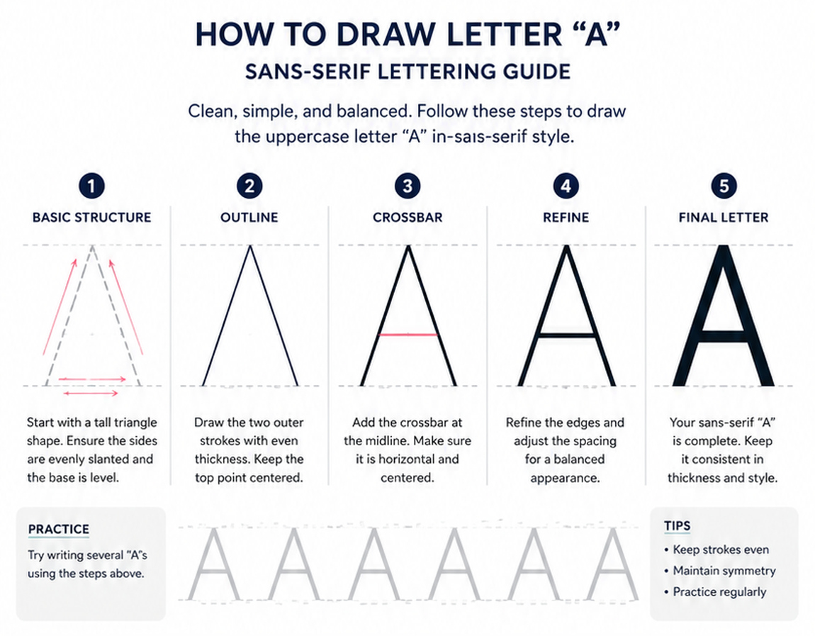
Mastering the Sans-Serif "A": A Step-by-Step Lettering Guide
Welcome to your ultimate resource for font design, typography, and poster lettering! Whether you are designing a bold poster, creating custom word art, or practicing hand-lettering, mastering the foundational anatomy of each letter is essential.
As shown in the guide above , we are breaking down the process of drawing a clean, perfectly balanced uppercase letter "A" using the Sans-Serif style.
What is Sans-Serif and Why Does It Matter?
In typography, "serif" refers to the small decorative lines or "feet" at the ends of character strokes. "Sans" means without—therefore, Sans-Serif fonts are completely stripped of these decorative extensions.
The core characteristics of this style are being clean, simple, and balanced. Because there are no decorative flourishes to hide mistakes, the beauty of a sans-serif letter relies entirely on its geometric precision, consistent stroke weight, and perfect symmetry. This minimalist aesthetic makes it the go-to style for modern posters, digital interfaces, and high-impact signage where high readability is required.
The 5-Step Breakdown to Drawing the Perfect "A"
Follow these structured steps to build your letter from scratch:
1. Basic Structure: Every great letter starts with a solid foundation. Begin
by visualizing or sketching a tall, isosceles triangle shape using light
guidelines. It is crucial to ensure that both sides are evenly slanted
and that the base rests perfectly level on your baseline. 2. Outline: Once your structure is set, draw the two main outer strokes
(the legs of the 'A'). Focus on keeping the stroke thickness completely
even on both sides, and make sure the top point remains perfectly centered. 3. Crossbar: Add the horizontal crossbar at the midline of your structure. Precision is key here—the line must be perfectly horizontal and centered to neatly divide the inner negative space. 4. Refine: Take a moment to look at the overall shape. Refine the edges,
sharpen the corners, and adjust the surrounding negative space. This step
is all about tweaking the proportions for a highly balanced, professional
appearance. 5. Final Letter: Your sans-serif uppercase "A" is complete! Clean
up any stray guidelines and ensure the entire character maintains a consistent
thickness and style from top to bottom.Pro-Tips for Better Lettering
To elevate your typography and poster design skills, keep these core principles in mind every time you practice:
Keep Strokes Even: The defining trait of modern sans-serif lettering is uniform stroke weight. Avoid letting one side become thicker than the other.
Maintain Symmetry: The letter "A" is naturally symmetrical. Always check that the left side perfectly mirrors the right side in angle, width, and weight.
Practice Regularly: Typography is a muscle-memory skill. Use the practice rows shown at the bottom of the guide to trace and draw multiple "A"s until the proportions feel natural to your hand.
Mastering this single letter gives you the structural blueprint to conquer the rest of the alphabet. Happy lettering!
Welcome to the elegant world of script typography! While block letters focus on rigid geometry, cursive lettering brings movement, rhythm, and personality to your designs. It is the perfect style for adding a sophisticated, handcrafted touch to custom invitations, creative posters, and artistic logos.
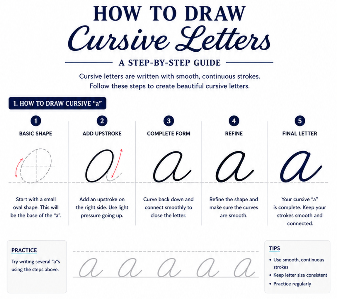
As detailed in our structural guide , we are breaking down how to seamlessly draw a lowercase cursive "a" using smooth, continuous motions.
The Elegant Flow of Cursive Typography
The defining trait of cursive writing is its fluid, connected nature. Cursive letters are written with smooth, continuous strokes rather than separate, lifted lines.
Unlike the geometric sharpness of sans-serif or the structured weights of serif fonts, cursive relies on a natural slant, rhythmic loops, and smooth transitions. The secret to beautiful cursive isn't just drawing the letter itself, but maintaining a steady momentum so each character flows naturally into the next, creating a harmonious and elegant layout.
The 5-Step Breakdown to Drawing a Fluid Cursive "a"
Follow these guided steps to master the motion and anatomy of the lowercase cursive "a":
1. Basic Shape: Start by visualizing a slanted, small oval shape. This simple
oval serves as the core base of your lowercase "a". 2. Add Upstroke: From the bottom right of the oval, guide your pen upward
to add an upstroke. Use very light pressure as you move the line going
up. 3. Complete Form: Curve your stroke back down from the top and connect it smoothly to fully close the main body of the letter. 4. Refine: Go over your line work to refine the overall shape. Pay close
attention to the transitions, making sure all the loops and curves are
completely smooth. 5. Final Letter: Your cursive lowercase "a" is officially complete!
Focus on keeping your strokes uniform, fluid, and beautifully connected.Pro-Tips for Seamless Script Lettering
To elevate your script designs and achieve a professional calligraphic finish, keep these three key principles in mind:
Use Smooth, Continuous Strokes: Avoid breaking up your lines mid-way. Try to let your hand move in one continuous, confident motion to prevent jittery edges.
Keep Letter Size Consistent: Maintain a uniform height and slant for every letter along your baseline. This consistency gives your text a beautifully balanced, professional look.
Practice Regularly: Developing muscle memory is essential for smooth handwriting. Take advantage of the practice rows at the bottom of the guide to trace and repeat the shape until it feels effortless.
By understanding the continuous flow of cursive strokes, you can bring a dynamic sense of elegance and movement to your text layouts. Grab your favorite pen and enjoy the rhythm of script lettering!
Thank you so much for visiting our typography platform!
We are incredibly grateful to support your educational journey, language learning, and artistic hobbies. Whether you are using our grid guides to finish a high school poster project, decorate a cozy family party, or polish your professional design layouts, your creative energy inspires us.
Keep practicing, stay curious, and happy creating!
 Terms of Use & Disclaimer
Please read and understand the following terms before using this website:
Accuracy of Information
We make every effort to ensure the accuracy and completeness of the information on this website. However, we cannot guarantee that all content is entirely accurate, current, or error-free. We assume no responsibility for any issues arising from inaccuracies or omissions in our content.
Use of AI (Artificial Intelligence)
This website utilizes AI-assisted technologies in the drafting, data organization, and summarization processes to enhance content quality and efficiency.
Copyright and Ownership
Unless otherwise stated, all text, images, charts, and visual content on this website are created by the site owner and are protected by applicable copyright laws.
Usage Restrictions
Unauthorized reproduction, copying, redistribution, or commercial use (including but not limited to selling or distributing our content as design materials, whether for profit or not) of any content on this website is strictly prohibited without prior written consent.
Disclaimer of Liability
Your use of this website is at your own risk. The site owner shall not be held liable for any direct or indirect damages—including system errors, computer viruses, data loss, or disputes—resulting from your access to, use of, or downloading of materials from this site. By using this website, you agree to assume full responsibility for your actions.
privacy-policy